
AppUi
Overview
AppUI refers to an API and a set of components that enable iTwin.js apps to implement iTwin UI's App UI design. This design organizes the iModel data into various components on the screen. Graphical data is usually displayed in a Viewport, while information such as element properties and data hierarchies are displayed in Widgets. An app using the App UI design will have a look similar to this:
The layout of an AppUi app has the following features:
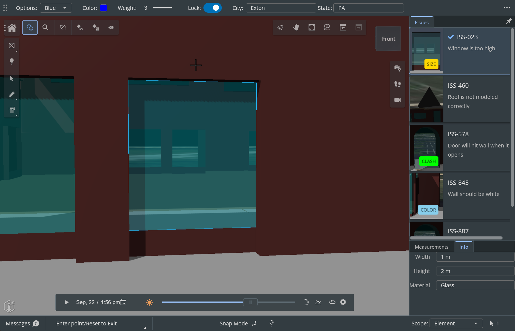
Tool Settings: a container for any components that change the operational settings of the currently executing Tool. These settings are, by default, displayed in a bar at the top of the window:

Status Bar: a container that displays notifications, messages from the app, and any feedback from the currently executing Tool. The Status Bar displays as a footer at the bottom of the window:

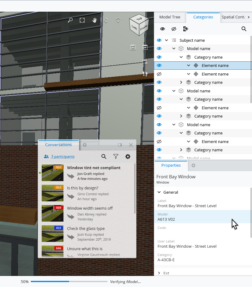
Widgets are containers of relevant feedback and content for the app's user. They can float or be docked into one of the panels surrounding the content area. Here, we see a "Conversations" widget floating, while "Properties," "Categories" and others are docked into the right-hand panel:
There are two special Widgets that float on top of the Content Area in the upper right and left corners. The Tool Widget in the upper left contains buttons used to launch iTwin.js Tools or functions. The View Navigation Widget contains buttons to launch tools that manipulate the active graphic view, such as zoom, pan, and rotate.
AppUI Components
Details about the components used to implement AppUi apps:
The React components that make up the AppUi interface are in the appui-react package.
The imodel-components-react package includes components that work with iModel data, but may be used either inside or outside an AppUi.
React components in the components-react package are complex components used to display and edit properties are hierarchies. They have no direct dependencies on iTwin.js frontend classes and can be used inside or outside AppUi apps.
The core-react package is made up of simple React components that can be used anywhere you would use React. Components in the Bentley project iTwinUI React are also used in AppUI and can be used anywhere you can use React components.
Last Updated: 27 October, 2023